Obamacare Tool
Obama for America
Legislation is notoriously hard to explain in a concise way, and the Affordable Care Act or “Obamacare” was no exception. In the spring of 2012 the campaign needed to simply and clearly lay out the benefits of the landmark new healthcare law. We did this by making it plain-spoken and personal.
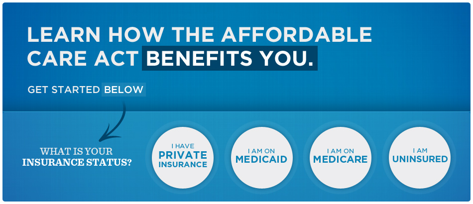
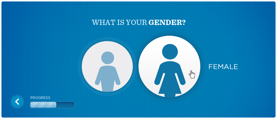
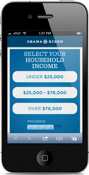
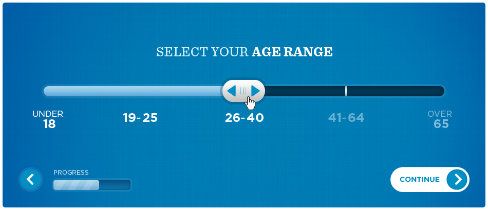
Instead of a typical “calculator” in which someone fills out a needlessly long form, clicks submit, and awaits their report card – we decided to try something different. We wanted to reduce friction, and deliver as much meaningful content as quickly as possible. We did this by working with the policy department to structure the information into bite sized chunks.
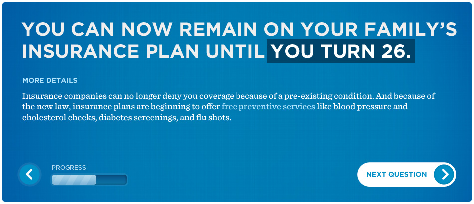
You tell us one thing about yourself or your family, we give you one benefit of the law as it relates to you. Tell us another thing, we’ll get even more personal. If you make it to the end, that’s fantastic. But if all you do is stick around for a few seconds and a couple mouse clicks, we are still able to deliver memorable facts that you can put to use.
By designing the UI to be playful and fun, we created a tool that people wanted to use – no typing required. The results spoke for themselves, with a remarkably high number of people making it to the end of the experience. And combined with the full court press the rest of the campaign was making around healthcare, we helped move the needle at a crucial time in the campaign.
ABOVE
Tactile and engaging UI elements were key, and an example of the plain-spoken messaging.
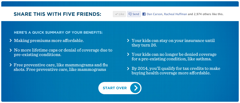
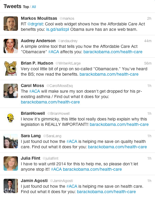
At the conclusion of the experience we delivered tweet-length information of all the ways the Affordable Care Act was beneficial to you and your family. By way of a direct sharing ask directly above, the tool spread quickly through social networks and helped shape the conversation.